What’s In A Niche Company Logo?
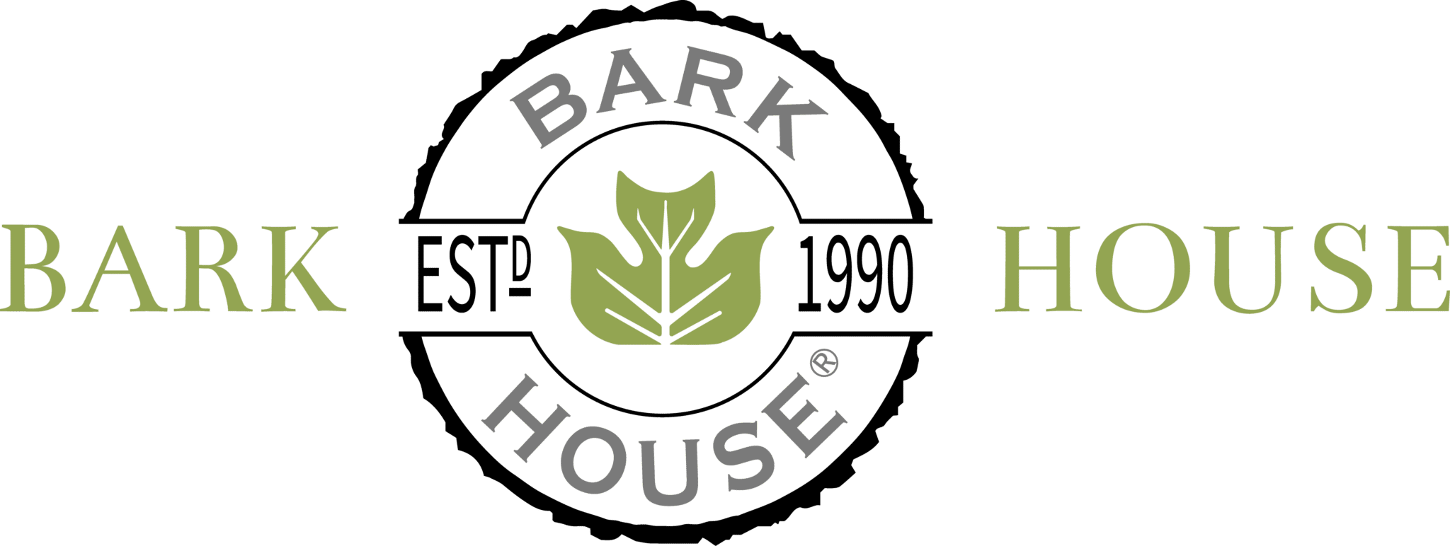
The Bark House® Brand logo has two concentric circles and varied elements within. Moving toward the center, a more intimate meaning is revealed. All elements align with one unifying purpose, reflected in the poplar leaf.
The outermost circle has two associations for us. The most obvious is the bark of a poplar tree that inspired the logo design. Bark is the protective skin for the tree and shares this meaning of strength and protection with the company. The other association is of a gear that is wiser with wear. The gear became a strong symbol of the Industrial Age, “a time of great change in economic and social organization… characterized chiefly by the replacement of hand tools with power-driven machines”. The gear remains a powerful symbol today. But we now view business as a complex tool to accomplish good in the world. As such, the gear represents less of a hard mechanized part and more of a collaborative whole. For examples of this idea, review some of our INFOGRAPHICS.
The brand name, “Bark House”, is on the second level, moving inward. Indigenous populations across the world recognized the strength, resilience and flexibility of bark. They used it on structures for protection and gathered in community under its shelter. In modern construction, the bark was one of the most neglected layers of the tree. Our company was created to utilize Reclaimed Appalachian Wood Waste (RAW™) and utilizing this valuable resource chartered the creation of our flagship line. The Founders’ personal ancestry; love of travel, exploring indigenous populations and architectural extrusions; their support of building community – these are all elements that relate to the name “Bark House”.
The third element has been added in the past seven years. It was inspired by Brent Christopher Simmons and provides a testimony to the time we have invested in the development of this business and subsequent industry. It was important that our longstanding community of employees, vendors, distributors and customers were acknowledged for being a part of this business plan for the long-haul; that we view this business as a legacy for the generations that follow.
There is a thin line that precedes the inner-most part of the design. It brings us closest to our core belief that life is a circle with each part impacting the larger whole. We are born into the circle at a particular location with a given perspective and some pre-disposition. But it is the privilege of being human to have the ability to move upon the circle and gain new perspectives, to touch – be touched and grow. It is upon this inner circle where we interact with others who bring their gifts to our life. It is within this slightly more protected space that allows and beckons for relationship.
[ctt title=”She said that it was in the winter that she could see the vast expanse of interwoven mountain ranges that we are blessed with in this part of the world.” tweet=”It was in the winter that she could see the vast expanse of interwoven mountain ranges that we are blessed with… http://ctt.ec/ci2P0+” coverup=”ci2P0″]
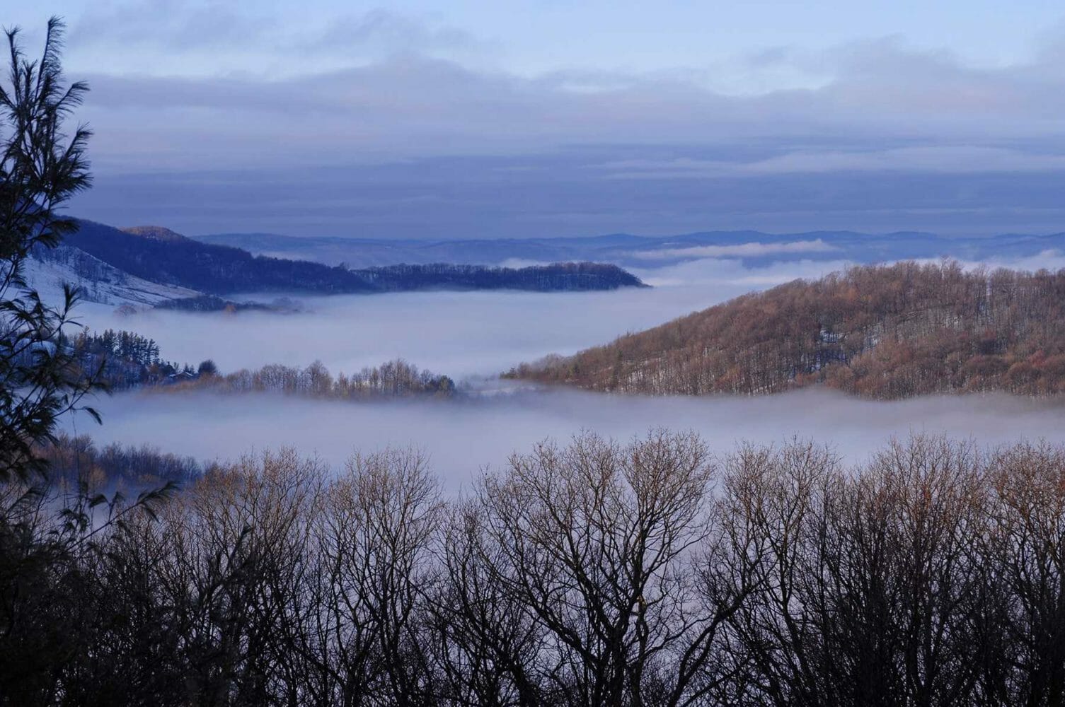
At the very center of our logo is the green poplar leaf. It reminds us that there are seasons in nature, and seasons in business. New life comes forth every year with the coming of spring. Summer brings warmth and bounty. Fall adds vivid color and fresh air while winter showcases the underlying architecture. At the center, our collective personal story exists. It is my great-grandmother’s words expressing her love for winter that keep me warm on the cold days. She said that it was in the winter that she could see the vast expanse of interwoven mountain ranges that we are blessed with in this part of the world. The poplar leaf acknowledges reverence and responsibility in caring for all the stories that rest and play upon the mountain mist. This is the heart of who we are as a company.
 Special thanks to Todd Bush Photography for this photo.
